

- cross-posted to:
- [email protected]
- cross-posted to:
- [email protected]
Reddit refugee here.
I have really started to like Lemmy and love the fact that it’s free and open source, but I wasn’t feeling so home with the UI, so I found nice looking style from https://userstyles.world/style/10345/lemmy-world but I personally prefer dark theme so I adjusted some colours and made the radiuses and margins bigger. I thought that maybe someone will find this useful and hence I decided to post it here. I am not a professional programmer, just a guy who likes to tinker with computers so this style may not be perfect. Critique, feedback and suggestions are welcome.

Edit: The colors are from reddit and if you want the colors to look more like the original lemmy, change the bg primary and default to hex #303030 and #222222. I really like this color scheme too
--bg-primary: #303030;
--bg-default: #222222;
Edit2: I have now made some small adjustments using the feedback and suggestion I got from you. I’m really grateful for the feedback :)
I also have now two styles, which have slightly different color scheme https://userstyles.world/user/VILPAUTOEE
Keep the feedback coming ;D Thx
You must log in or register to comment.
Lemmy Enhance Suite when?
We need this
And what is it with the narrow aspects? I totally get the need for mobile support, but the default desktop view looks like it’s trying to play nice with old 4:3 aspects. If that’s the root design goal, I sure hope we can let that design goal die. In a 16:9 maximized window there is so much wasted real estate it pains me.
Lemmy doesn’t run very well on mobile either. It crashes and burns on my iPad (probably because it doesn’t fully support whatever fancy JavaScript it relies on), and Kbin is the only way to connect with Lemmy communities, since their site does work.
I think that’s the websocket connection that they are working on removing in the next version. Should make the loading issues on mobile go away.
That’s weird. For me it is kbin that crashes all the time. Lemmy works fine. I like kbin’s vibe and concept, I just figured it was still really buggy. Now I’m thinking maybe the problem is on my end.
I know - the default layout seems ludicrously cramped on a widescreen monitor. I wonder why the devs ever decided on the default CSS values.
After some tweaking, I’m quite happy with my setup now.
deleted by creator
Hey! This looks awesome. Im a programmer working on a UI. I would really really really like to use this and work with you on completing my project.
You can use this freely and I’m open to improvements and changes to the code. You can for example make pull request to the github repo :)
This is what’s beautiful in open source. I wonder if any one has had any luck making the old.Reddit nesting style yet
Yes! I hate the default look that doesn’t separate in “zones”
I really like it. But I also think that it’s not a great idea to use colors similar to Reddit, it’s best if Lemmy (or each instance) finds its original design for those
Yeah I think so too, and that’s why I created two styles with different color schemes. I just think that some reddit refugees might have gotten used to the reddit colors and find them more familiar
Looks great!, thanks for sharing!
Hi, thanks for the feedback. The extension that userstyles.world redirects you to is Stylus not Stylish. It’s a fork of Stylish and they even state on their web site that “Any and all analytics, telemetry, and data-collection have been removed completely. We’d rather not know what you’re up to.” https://add0n.com/stylus.html
I hope this clear things ;)
ahh, didn’t know. Thanks!
Is there any way to get it working on Android?
Use a browser that allows you to install extensions.
Firefox and brave does not support it, unfortunately. Anyway I found an alternative which is the “thunder” app, although they still do not support comments/new posts. Apart from that it looks excellent and can recommend
I tweaked margin and padding. Is just a lot of wasted space if you ask me. .post-listing + hr.my-3 { margin-block: 0.2ch !important; } .post-listing { padding: 0.4rem 1rem; } :root { –radius-1: 1px; –radius-2: 2px; –radius-3: 4px; –radius-4: 8px; }
 ___
___Thanks for sharing, need to try this tomorrow!
Edit: Just installed it now, looks perfect! Great job!
Thanks for sharing!
The main problem with the Lemmy UI on desktop, IMO, is the cramped and narrow page width. There’s so much wasted space on either side of the content.
I’m currently using a customized version of this one: https://github.com/HrBingR/Lemmy_CSS
Super awesome! Appreciate the UI upgrade.
Just wanted to ask your opinion. Which is better color scheme. The reddit colors or the lemmy’s?
Reddit:
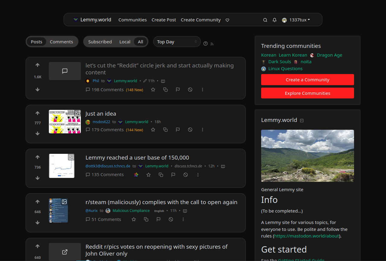
Lemmy:
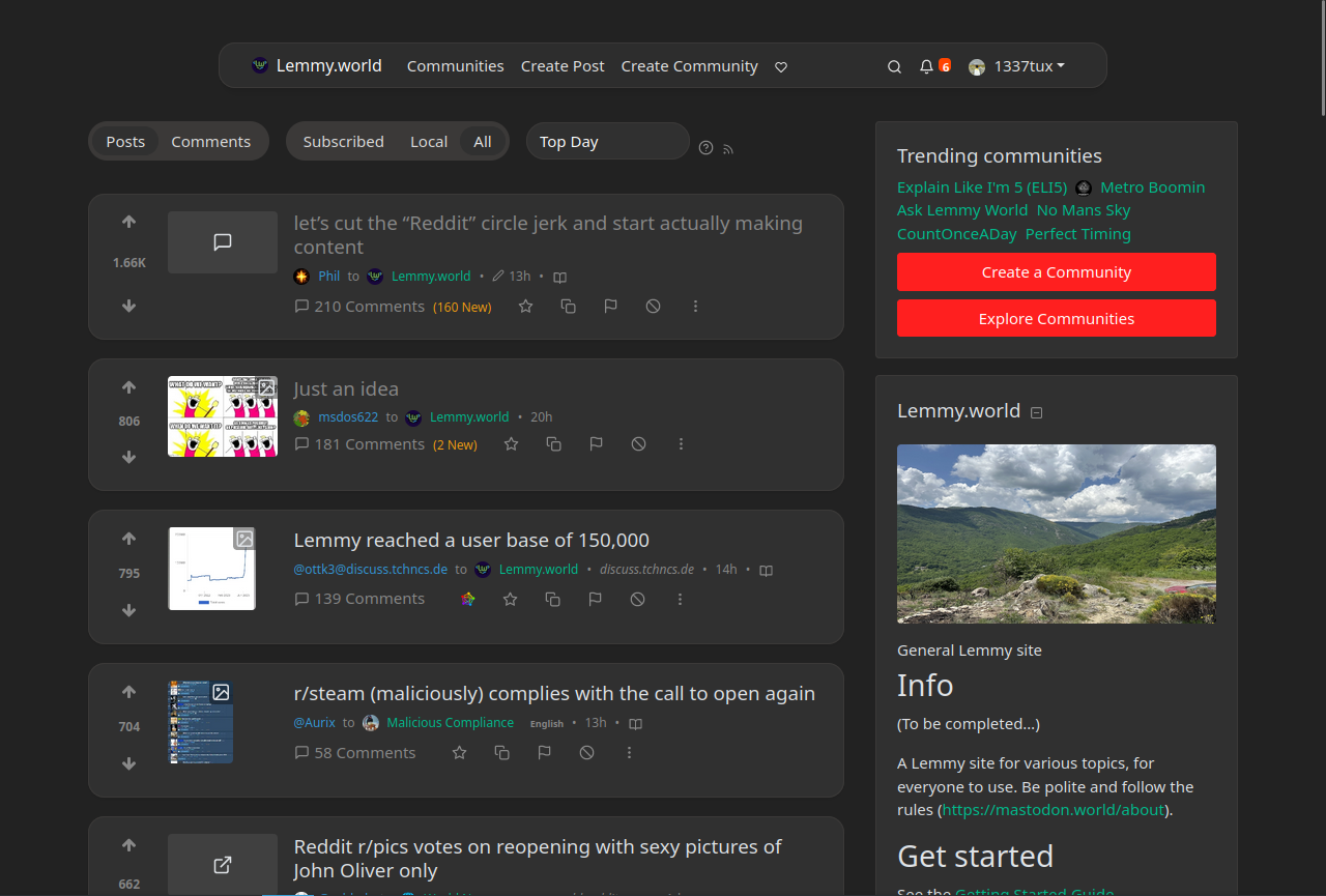
Bottom looks better. It would be even better if you replaced the red buttons with blue (blue chrysanthemum shade).
This is just me but I missed the day when the site provided us to customize our profile page. Like friendster for example we can change the look of the buttons, we can change the size of the fonts and etc.
It shows us a little bit of our personality. But I know that it’s no longer a thing. The closes experience I could think of is how we design our linux desktop. In windows it would be using rainmeter.


