fossilesque@mander.xyzdeleted by creator to Science Memes@mander.xyzEnglish · vor 2 Jahrenain't your buddy, pal!mander.xyzimagemessage-square137linkfedilinkarrow-up1627arrow-down122
arrow-up1605arrow-down1imageain't your buddy, pal!mander.xyzfossilesque@mander.xyzdeleted by creator to Science Memes@mander.xyzEnglish · vor 2 Jahrenmessage-square137linkfedilink
minus-squarekwomp2@sh.itjust.workslinkfedilinkEnglisharrow-up54·vor 2 JahrenInteresting. Can we have have at least a tiny bit of info how this data came to be? Not just this one, but all the infographs, maps etc. Always leave entirely open if someone just guessed the data for the lulz. This makes me a litte sad sometimes
minus-squarefossilesque@mander.xyzdeleted by creatorOPlinkfedilinkEnglisharrow-up34·edit-2vor 4 Monatendeleted by creator
minus-squareTheTechnician27@lemmy.worldlinkfedilinkEnglisharrow-up32·vor 2 JahrenSo the map is more accurately titled “How American Twitter users refer…”
minus-squarekwomp2@sh.itjust.workslinkfedilinkEnglisharrow-up26·vor 2 Jahren“White american male twitter users”, according to the last paragraph
minus-squareTheTechnician27@lemmy.worldlinkfedilinkEnglisharrow-up13·vor 2 JahrenI was wondering why a certain word wasn’t showing up…
minus-squaresem@lemmy.blahaj.zonelinkfedilinkEnglisharrow-up8·vor 2 JahrenI could have not clicked that video. But I did. And I regret it.
minus-squareOpenStars@piefed.sociallinkfedilinkEnglisharrow-up4·vor 2 JahrenOh dear God… I now need eye bleach, for my ears? 🌽
minus-squarekwomp2@sh.itjust.workslinkfedilinkEnglisharrow-up4·vor 2 JahrenThanks! I think it would be a great rule of thumb for lemmy to always include sauce and especially the sidefacts about the data that relativize it. (See other replies) Less shiny maybe, but more real :)
minus-squarefossilesque@mander.xyzdeleted by creatorOPlinkfedilinkEnglisharrow-up3·edit-2vor 4 Monatendeleted by creator
minus-squareMouselemming@sh.itjust.workslinkfedilinkEnglisharrow-up3·vor 2 JahrenSo basically you’re doing the “don’t ask, just say something on the Internet to issue a challenge” method of learning stuff?
minus-squarefossilesque@mander.xyzdeleted by creatorOPlinkfedilinkEnglisharrow-up3·edit-2vor 4 Monatendeleted by creator
minus-squarekwomp2@sh.itjust.workslinkfedilinkEnglisharrow-up2·vor 2 JahrenSometimes its a fine line between infographs and memes. Sometimes it isn’t


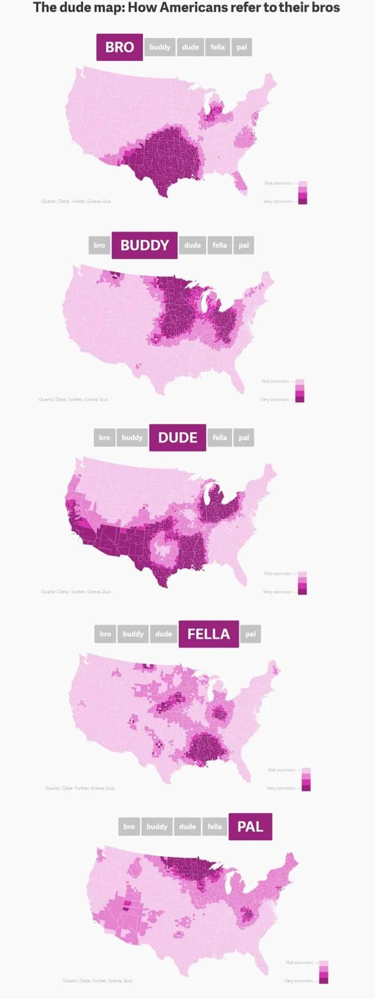
Interesting. Can we have have at least a tiny bit of info how this data came to be?
Not just this one, but all the infographs, maps etc. Always leave entirely open if someone just guessed the data for the lulz.
This makes me a litte sad sometimes
deleted by creator
So the map is more accurately titled “How American Twitter users refer…”
“White american male twitter users”, according to the last paragraph
I was wondering why a certain word wasn’t showing up…
I could have not clicked that video. But I did. And I regret it.
Oh dear God…
I now need eye bleach, for my ears? 🌽
deleted by creator
Thanks! I think it would be a great rule of thumb for lemmy to always include sauce and especially the sidefacts about the data that relativize it. (See other replies)
Less shiny maybe, but more real :)
deleted by creator
So basically you’re doing the “don’t ask, just say something on the Internet to issue a challenge” method of learning stuff?
deleted by creator
Sometimes its a fine line between infographs and memes. Sometimes it isn’t