cm0002@lemmings.world to Data is Beautiful@mander.xyzEnglish · 9 months agoContradictions in the Biblelemmy.mlimagemessage-square64linkfedilinkarrow-up1399arrow-down136
arrow-up1363arrow-down1imageContradictions in the Biblelemmy.mlcm0002@lemmings.world to Data is Beautiful@mander.xyzEnglish · 9 months agomessage-square64linkfedilink
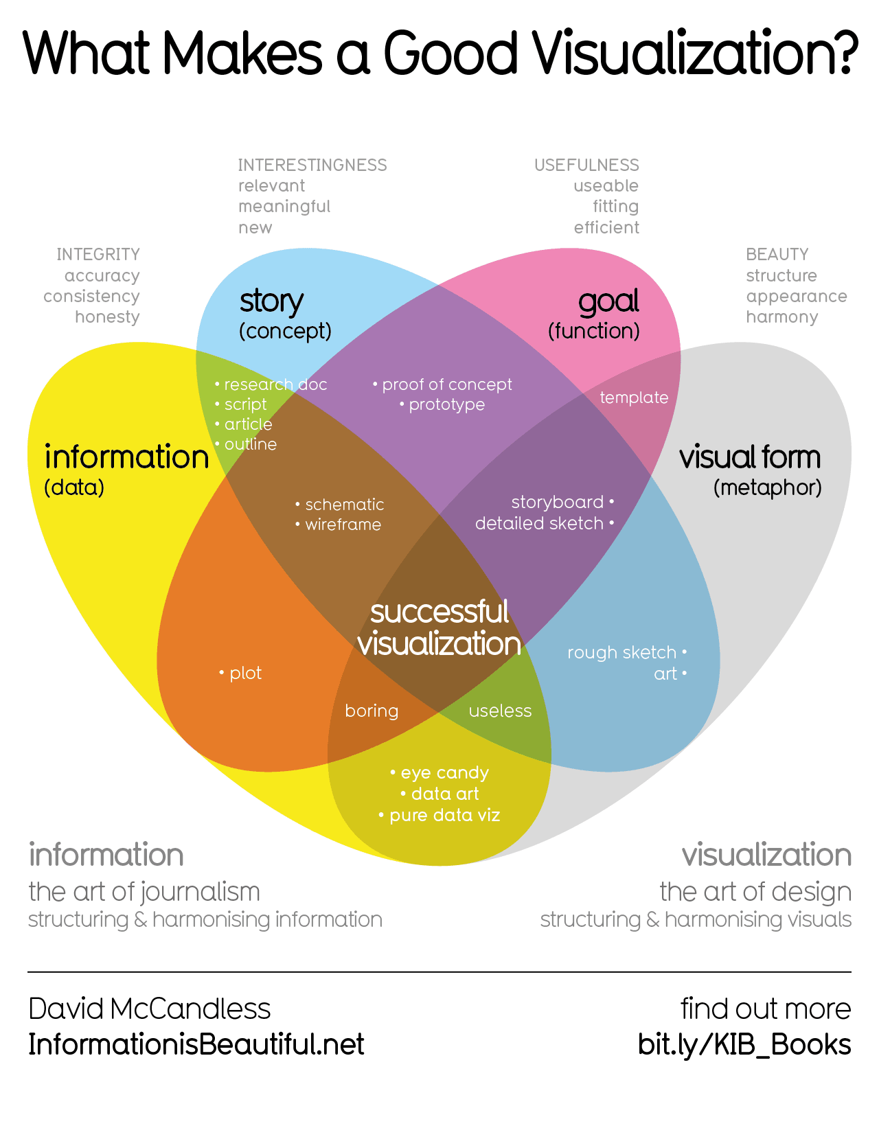
minus-squarelolola@lemmy.blahaj.zonedeleted by creatorlinkfedilinkEnglisharrow-up8arrow-down3·9 months agoI think a beautiful dataset wouldn’t have a duplicate entry in the first ten rows.
minus-squareFaceDeer@fedia.iolinkfedilinkarrow-up4arrow-down2·9 months agoThe duplication would result in an arc being drawn twice with exactly the same pixels. Ie, it would make no difference whatsoever to the display. It has no effect on the “beauty” part. You might as well be objecting to the font that the text is in.
minus-squarelolola@lemmy.blahaj.zonedeleted by creatorlinkfedilinkEnglisharrow-up3arrow-down1·9 months agoFont choice is also a factor in data visualization hehe
minus-squareFaceDeer@fedia.iolinkfedilinkarrow-up2arrow-down1·9 months agoYou could literally chop the lower half of this image off and it would make no difference to the data visualization.
minus-squarelolola@lemmy.blahaj.zonedeleted by creatorlinkfedilinkEnglisharrow-up4·9 months agoI’d say it’d be an improvement because I wouldn’t have been distracted by this little mistake lol I’m a data scientist and a nitpicker, not in that order.


I think a beautiful dataset wouldn’t have a duplicate entry in the first ten rows.
The duplication would result in an arc being drawn twice with exactly the same pixels. Ie, it would make no difference whatsoever to the display. It has no effect on the “beauty” part. You might as well be objecting to the font that the text is in.
Font choice is also a factor in data visualization hehe
You could literally chop the lower half of this image off and it would make no difference to the data visualization.
I’d say it’d be an improvement because I wouldn’t have been distracted by this little mistake lol
I’m a data scientist and a nitpicker, not in that order.