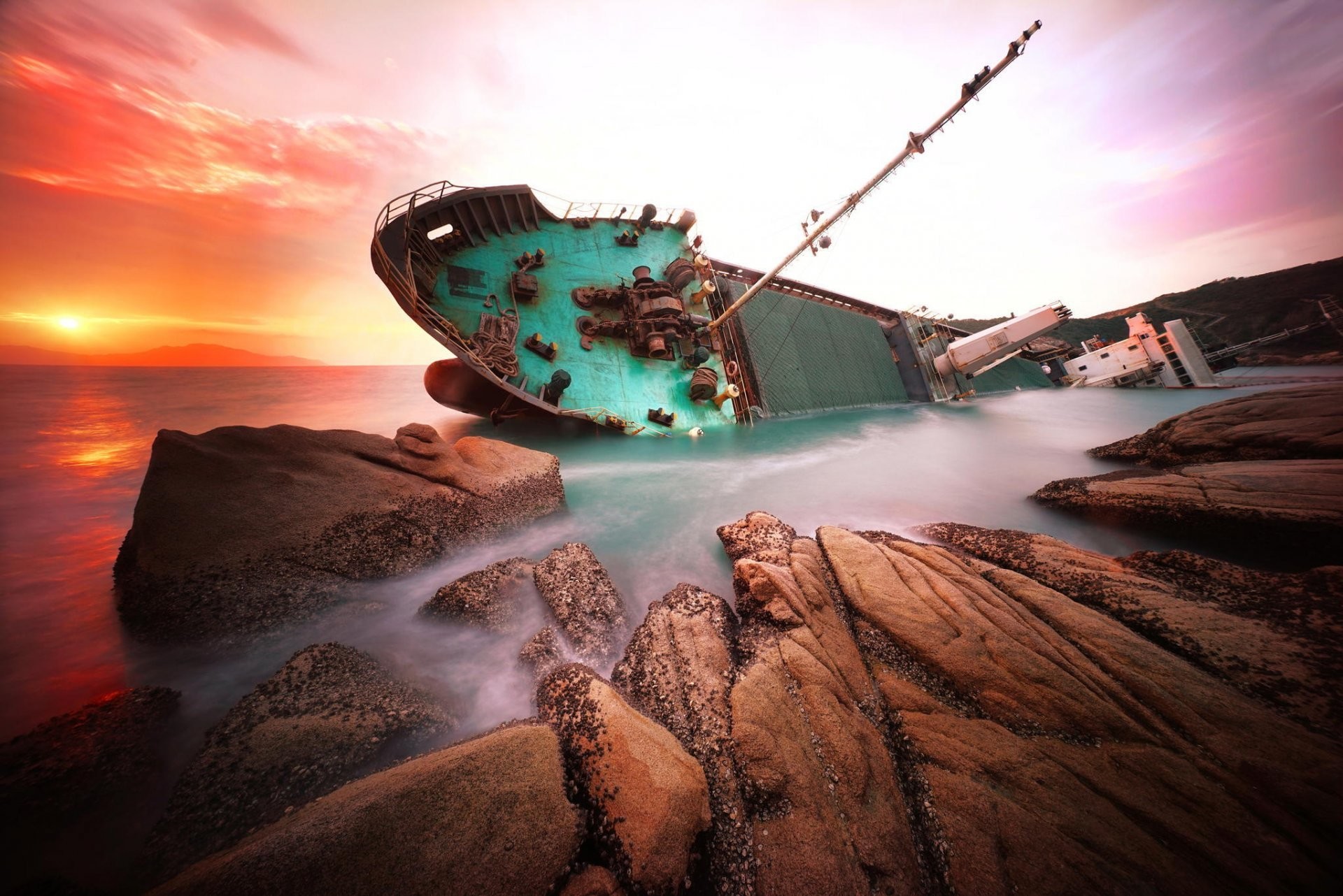
Took this at the old fishing boat wreck at Corpach, near Fort William, crouched low by the bow. I liked it at the time but it never quite worked, and it took a critique to show me why.
- I exposed for the sky and lost the boat. The shadow side of the hull is just a dark shape. The fix is simple: meter (or tap to expose) on the hull, not the sky, and accept a slightly brighter sky. Then zoom right in and check you can see the wood grain.
- The horizon runs downhill to the right. Not by much, but enough that your eye slides out of the frame. Grid on, or rotate in the edit and crop the corners off.
- The foreground pebbles are a bit soft. They take up the bottom third, so they carry a lot of the texture. Focusing about a third of the way up from the bottom would have helped.
The one thing it said I got right was the low angle: “The low, close viewpoint makes the hull feel tall and imposing, which suits the subject well.” So I’ll take that.
Disclosure: the critique came from Artluni, a tool I built for exactly this kind of feedback, with each note pinned to the part of the photo it means. If anyone wants to try it there’s a no-signup preview on the homepage and 3 free critiques with no card: https://artluni.com/?code=FOUNDING50&ref=lemmy-photography . If you end up liking it, FOUNDING50 gives half price for your first 6 months, then normal price, cancel any time. Happy to hear what you’d have done differently with this one, too.
I’m getting reports on this one complaining about the advertising and also the AI aspect of this. On the advertising thing, I really don’t think I’m one to talk. Folks, what is our consensus here?
Yeah quite clearly an ad. But it is at least photography-related and could be useful to some.
Personally I’m ok with AI being used this way, it’s not generating the pictures or anything, just providing advice. That said, it’s advice on a very subjective topic - I can see some value in it for helping beginners pick up basic mistakes, but it otherwise won’t know what the photographer was trying to capture with a picture, or what look they were going for. What if they were going for a silhouette look here for example?
On the AI though, and I could be wrong, but it kinda feels like it’s just a front end for a mainstream model, in which case there’s the ethical questions around what pictures it was trained on and where the critiques of those images came from.
As far as the ad goes, I get that the whole “I found this tool and it helped me” thing is to get people to identify with the post, but the messaging is confusing. Software that tells you how to take better photos, but its creator couldn’t tell they exposed for the sky? Either that didn’t happen, or you shouldn’t be offering advice. Or it’s an advertising tactic that you need to be really careful with :)
I can’t open the sidebar for some stupid reason atm but is there a stance on ads here in general?
There isn’t, which is why I wanted to get a feel for what the community wants. I inherited this board and have not changed anything on the sidebar yet.
Ah gotcha.
Personally I can see value to the community in raising awareness of certain tools or resources. But there is obviously a blurry line between recommendation and advertising which I think we need to stay away from defining too closely, and focus instead on net community benefit, which yourself/the community can determine case by case.
For this one, others may disagree but on the surface at least I reckon it’s probably ok, just the way it was approached set off the alarms in my ad-weary brain.
Two approaches more broadly, in order of preference:
- A separate community for tips, tricks, and tools - leave this one for posting pictures and general discussions. (This separate community would need a rule like the below regardless.)
- Otherwise if it’s to all stay in the one place, which might make sense given we’re not huge - for anyone spruiking a product, theirs or not, they must include a clear description of what it is, who it’s aimed at, and what their interest is in it. Obviously common sense applies, eg we don’t need to explain what LightRoom is or who Canon are every time they’re mentioned.
Their username advertises the AI as well. Feels like that’s the entire point
Yeh not a fan feels like an ad. If it slides there will likely be more.
Was the disclosure there when the post went up? i saw the post yesterday and didn’t notice it like that, i noted a mention that an AI review occurred, but that was it.
This is literally an AI promo post; why are you not downvoting it?
Did they finally figure out how to sneak ads past you?
i want to know what humans think of my photos, not a machine’s presentation of words resembling a plausible critique
Yeah. Nah. I don’t care about an AI that calls what a statistical median should be. This is a great picture
Not mad at this photo at all. You could convert it to B&W and make it even more dramatic.
Thanks! I hadn’t tried a B&W version, that’s a good shout. The sky would probably carry it more.
I personally quite like the wonky horizon. Normally it’d jar badly to me, but it strangely works from an abstract point of view, countering the tilt of the boat.
I get there could be an improvement to the exposure, buy it’s not really that bad. I think it looks worse with the use of a wide angle lens resulting in an imbalance between light & dark elements. Re-composing will help as much as anything.
Talking of the wide angle lens - I’m not that keen on it to fit more into the picture unless it is used to really accentuate something, but then it becomes more graphic design than art-photography for me, if you see what I mean!
In your image it results in the pebbles & sky dominating too much in an unbalanced manner, I think because you can see how they’re stretched. This is probably why your software thinks it’s too softly focussed in the foreground. The landscape behind also starts to get lost as it thins out with wider angles so the foreground interest needs to take over.
I agree, the low p-o-v is great, just move in a tad to accentuate the way the subject looms over the viewer. Also make the chain more prominent to lead the eye +and yes, lose the people and board on the ground). This should also solve much of the negatives in one action! Try some views a tad to one side or the other & see how that plays out too (assuming you go back!)
Overall, a nice shot despite some critisisms :)
Really useful, thanks. Fair point on the wide angle, I think that’s what’s pushing the light and dark out of balance. I’ll have another go at the composition.
Hope it helps. I’d be interested to see the outcome.
Additionally there are composure issues
This particular photo would be improved much by cropping in closer to the subject.
Backing off from a subject to include foreground and sky only works well when the foreground and sky are both interesting and complement the subject.
In your photo, the foreground pebbly beach adds nothing; it just isnt interesting. The same applies to the sky. The white board laying on the beach distracts the viewer. As do the two chumps standing next to the boat, and the leaning crane on the left. The only interesting thing in this photo is the subject itself, which is composed to only occupy about 10% of the image. The vast majority of pixels in the photo are disposable.
That’s why this photo didn’t deliver the punch you might have thought it would: the photo’s technical flaws are not the problem. It’s the composition.
This is a good lesson in composure: the composition of a photo must never take precedence over the subject matter. You can’t “improve” a photo simply by widening the shot and putting the camera close to the ground. The subject matter at hand has to be accept and be evocative with that composition (as in the example I linked to above). This subject matter isn’t.
For this image on the day it was taken, a tighter crop and slight repositioning would make the boat more intriguing, spending a higher percentage of photo pixels on interesting subject . As in this photo. You can see here the sky and beach aren’t really that interesting, so the photographer did not compose them as first class citizens.
Taken on a different day with a different sky and different beach/water conditions, this composition might have worked slightly better. But probably not better enough.
Additionally,
Agreed, I think I backed off too far. A tighter crop on the boat is next on my list to try. Cheers for the example.