WHY did the USA vote against it
Because it makes them look smaller. Because reality.
Racism and white supremacy. Typical.
Some critics of the Mercator projection suspect it has remained widely used because it enlarges and centers Europe, as well as other Western regions such as North America, perpetuating ideas of European superiority.
The UN resolution notes “with concern that this distortion contributes to minimizing the perceived sizes of Africa, Latin America and South Asia, and perpetuating an unbalanced view of the world.”
Why do we always have to vote the dumbest possible way in these things?
"UN vote on whether we should eat glass: 99% against, US stands alone as In Favor ."
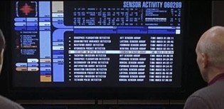
Why does the UN use LCARS?
Where can one find a good (pretty) interactive web map with this?
EDIT: Apparently it’s from equal-earth.com 2018 but it got hugged to death
Does it matter what projection the UN uses? Of course the actual UN logo is a wacky projection.
Dumbass United Stat…
Americans are probably the dumbest people on the planet.
Source: been here my whole life
Fuck all those who abstained and voted against
Moldova, the fuck do you care about this
Moldova, Ukraine, Estonia, Lithuania, and Georgia have actual problems to worry about.
I mean this is just UN navel gazing about the fairness of map projections. Countries that are staring down an increasingly unstable Russia probably aren’t too worried about that.
I saw two of the Baltics, and fair point, but now I’m curious about why Latvia didn’t go along with them.
Trying to suck up to the US without pissing off the rest of the world too much, presumably. Same for Georgia, Estonia and Ukraine. The one that actually surprised me is Serbia.
What gives, Serbia?
I hope they make the map of USA really small and Canada and Mexico really big.
@Canada government, please make this for us!
It’s such a tragedy that the Earth had to be a sphere. I mean, I know it was inevitable. But come on, universe. A sphere? Really? You had to have known about Gauss’s Theorema Egregium, yet you chose sphere. Now we’re all fighting over who gets to be squished or enlarged and in what directions.
you must be kidding

Lmao the fucking irony:
The US, which voted against the resolution, slammed the text as an ideological exercise that it said undermined the UN’s credibility.
“This initiative is presented as an anodyne effort to update cartographic proportions,” said Mike Waltz, the US ambassador to the UN. “The United States clearly sees it cannot be separated from the much larger and more radical ideological project it belongs to.”
Wow, the US government is so paranoid, because how the fuck in your right mind can you find a reason to think “everyone’s out to get me” because others want to edit a map? It’s also funny how they never specify what this “radical ideology” is, despite constantly complaining about it like a child would about their mother not getting them an ice cream.
Not even Israel voted with the US this time. Take this opportunity for reflection.
It’s because they don’t want the world to see it getting bigger as it starts annexing its neighbors’ land.
This might be the first time in history Israel voted differently than the United States of America
And of course, nobody is surprised.
I’m more surprised that Russia voted Yes
Russia doesn’t care because they’re big as fuck on any projection.
So is the US, but we voted no because we’re contrarian little pissbabies.
Russia’s been cozying up to Africa for a long time. And it was the AU which spearheaded this initiative.
Since Russia is actually very large, they’re probably thinking they’ll look even bigger than they already do!
My one question is why
Because they’re chauvinists on the way to fascism
Lmao “on the way”.
Guess they will soon not only have their own system of measuring distance, weight and temperature; but also their own system of displaying Earth. They want to live in their own version of reality i guess.
When were the United States is bigger than Russia.
Pardon?
When wereone where
Abstentions are also no
Abstentions are explicitly neither yes nor no.
Abstentions means let the others decide.
Mercator is bad as a world map, but the reason why it’s used on most online maps is that those online maps are usually used as local maps, where Mercator is a very good projection. It would be good if online maps switched projections if you zoomed out beyond a certain level.
The web maps I create I use different projection systems for different zoom levels. Mercator is the best we got globally, that’s why it’s lasted since the 1540’s. Usually as you get closer you should be using a state plane PCS. It’s not survey level of course but most maps are based on close enough unless it’s a survey map done by a licensed professional.
You make maps? I’ve been looking for halfway decent maps.
But they all look like hot garbage on a purely aesthetic level. Maybe that is entirely subjective, but the best world map (that can be switched to 3D too) is this ArcGIS NatGEO one. Other maps also have problems like showing names of countries and cities in their original, completely indecipherable language making them useless. I’d absolutely love some kind of open streetmap based PRETTY world map in English and that can switch different projections. And show things like the fucking equator. I mean how hard can THAT be? But every time I want to look at a map or globe I have to wait for the images to download for the 100th time instead of being cached because there is no (open source) map app for windows.
Not on iOS anymore but when you zoomed out on Apple Maps it became a globe. Not sure if that’s still true or I remember incorrectly and am confused with a 3rd party map, but that would be best on screens imo.
Google Maps zooms out to Mars.
Why? I don’t know.
Just checked. Apple Maps still zooms out into the globe on iOS
Nice, i didn’t like Apple Maps for navigation but i did really appreciate the design of things. They had 3d maps quite early in the city I live in and I really liked that too. Props to Apple for that.
Don’t they? At least Google Maps has for a while.
Feels like a fun math challenge to seamlessly convert between map projections based on zoom level.
They really have nothing else to worry about, do they? What a useless bunch of pricks…
The Mercator map, which has been in common use since the 16th Century, has come in for criticism as it shows Africa as similar in size to Greenland, even though it is 14 times larger.
Critics say this leads to the development needs and potential for countries near the equator to be minimised.I think that’s got more to do with the systemic legacy of colonialism than with which world maps people look at.
It’s both/and.


Let’s say you’re trying to convince a populace of an unpopular war to invade, I dunno, Greenland. You want to convince the country of its massive land & untapped riches.
Which map would you use?
but look at how large Australia looks in the second, maybe that is an alternative place to look to invade - and they have rearearth minerals
You’d have to defeat the native emu population, though. Good luck with that
My money is on the Emus.
on the up side to that is Emu taste real nice, and I hear that the US is having a problem with beef
Kangaroo is good too. Very lean though, gotta add a little fat to it
We practically already give away all of our natural resources. Hell, we actually PAY for big companies to take it and sell it overseas, tax free. Because be are playing 5D chess
The Mercator projection is also a systemic legacy of colonialism, so doing away with it doesn’t hurt.
The Mercator projection is a legacy of people needing a world map in which local regions preserve accurate directions and proportional distances (i.e., people who need a map for navigation instead of a global dick-measuring contest).
In the times of GPS, global navigation isn’t reliant on this specific map projection. On a local level (City or State/Province level), where most navigation for non-experts is taking place, the chosen map projection doesn’t matter that much. The people who are navigating distances where these things become relevant (pilots and ship navigators) are also expert enough to deal with most map projections. But for global issues, a map projection that actually represents land masses as they are in reality matters a lot.
Edit: I am aware about issues regarding GPS jamming. The latest tests regarding quantum navigation (which uses differences in earths gravity fiels) were working very well, so if jamming becomes a very common issue, these systems will proliferate quickly.
On a local level (City or State/Province level), where most navigation for non-experts is taking place, the chosen map projection doesn’t matter that much.
Yes, it does, because on a local level you want real-world right angles to be right angles on the map, which Mercator does, but other projections might not…
Most navigation software doesn’t show the map from the top, but from behind looking forward, and it communicates turns and lanes to choose regardless if your angles are 90° / 95° / 85° or what map projection is used. If you are still using paper maps in your own city - welcome to the future.
Edit: And to top it off, the crossroads being 90° is a uniquely american thing - every city in europe has a naturally grown layout. Since the US doesn’t give a fuck about anyone else (as seen in the vote and their renaming stuff into <whatever> America) I also don’t give a fuck about what maps they use.
Edit 2: If you use your current position as the center of the projection, anything close enough to be relevant stays at 90° - or so close that i dare anyone to see the difference.
Most navigation software doesn’t show the map from the top, but from behind looking forward
only when navigating, not when looking at the map
Do you really think that the distortion over the short distance shown while navigating matters? I don’t know many drivers that actually use their geometry kit when using a navigation app.
Every map projection has some inaccuracies and thing that they’re good and bad at. The Mercator is good at preserving shape and distance, which used to be quite important for navigating around the world, which was important for colonization. Other maps have accurate size but inaccurate shapes. The Mercator projection isn’t the worst, but less suited for the needs of today. We should all probably just use globes. The UN should also use globes.
Good luck keeping a globe in the glove box.
Just gotta inflate it…

You still use paper maps while driving inside of your own country? Free navigation software is ubiquitous. Noone cares about the projection used there, as long as it signals turns and lanes correctly, and long distance most countries have something called “signs” which tell you where the road you are on goes.
Mercator projection was favoured because it was useful for navigation due to preserving rhumb lines, representing them as straight lines on the map, and has been around for like 400 years.
Given that barely anyone does navigation like this any more it’s not that important to keep it as the default view for world maps that aren’t used for navigation such as a simple wall map. Web maps and the use of pseudomercator have definitely kept it relevant in modern times and as the most recognizable projection.
There isn’t much basis to say it’s used to “make colonial countries look bigger and Africa look smaller” except for people virtue signaling in blog posts over the last decade. If anything then it’s a psyop by Big Greenland.
As this post explains, you can just look at a globe if you want accurate size representation, because all map projections are distorted and there is always a tradeoff.
E: Oops I can see several people already explained this since refreshing the post.
it’s used to “make colonial countries look bigger and Africa look smaller”
I dont disagree, but I think if the case was opposite and a useful projection made the countries in power look smaller they wouldn’t have picked it as their favourite projection. The distortion is in favour of the (small) powerful countries, which may not have been the main reason but you can’t call it a happy coincidence either.
This may or may not be true—in fact I’ll just assume that it’s true, fuck it—but I will say that it’s kind of like being asked to have an opinion on whether this person or that gets top billing on the theater marquee: is it going to be Rose & Krants or Krants & Rose? Which do you think, morally, is the superior option? I really, really don’t care.
And it bothers me a smidge that people do only because I feel like they’re being distracted by jangling keys. But oh well, whatever. Not my business, I guess.
I, for one, thought Africa had a smaller footprint that it has because of the maps in school and it made me think that it was less signifiant than it is. It doesn’t make sense, because a country could be very little but have billions of people in it for example. Nonetheless, I get the feeling. If I was from a country that suffered from colonialism and whatnot, I’d want a better projection of it on 2d maps. Simply because I know a chunk of people would better see my nation’s place in the world.
A country’s, or a continent’s, signifigance has nothing to do with it’s size, though.
I mean, if we wanted to make the nations of Africa or Greenland feel better, does it follow that we could make them appear bigger on the map than they actually are? Just move the mercator around such that Africa is along the top or bottom edge of the map where things are larger?
I am absolutely not saying that people having a better understanding of Africa is bad. I just don’t think that this is really how that happens.
I remember thinking that Russia seemed pretty big on the map, and yet still, I’ve never had to take Russian culture as a class in high school.
[edit] I’ll add one thing, though. This decision has clearly pissed the US government off, which is based and incredibly funny. I’ll support it to that end.
Depends what type of significance. Of course it’s more significant when it’s larger in size if you value things like farmland, natural resources, fishing, transportation, infrastructure, timezones, language, etc.
If you think the US is similar in size to Africa, like I thought, and you compare the 51 states to the 54 countries, you might think each African country is similar in area to a state in the USA and extrapolate to other beliefs accordingly. Maybe you think there is a greater cultural cohesion in the entire continent because people are closer to each other and so on. Turns out, there is more than 1.5 billion people in Africa. That is way more than in the US, but the size is really skewed in the Mercator.
I don’t understand your point about wanting to make Greenland feel better. The Equal Earth Projection is more accurate when looking at land area, so it’s not a question of making people feel better about the size of their country, more of a question of not having the Mercator projection contributing to people thinking less of our country, amongst other things, like just being more factual.
And like the other commenter said, Russia doesn’t really have this problem anyway, it’s very large in all our popular projections.
No corresponding maximization of development needs and potential for Greenland either.
Oh, yeah, well Donald signed a new order changing every country’s name to America.
From now on all adresses: America [house number], America, America, America.
That’s a very Aladeen news.
all house numbers are 1776