

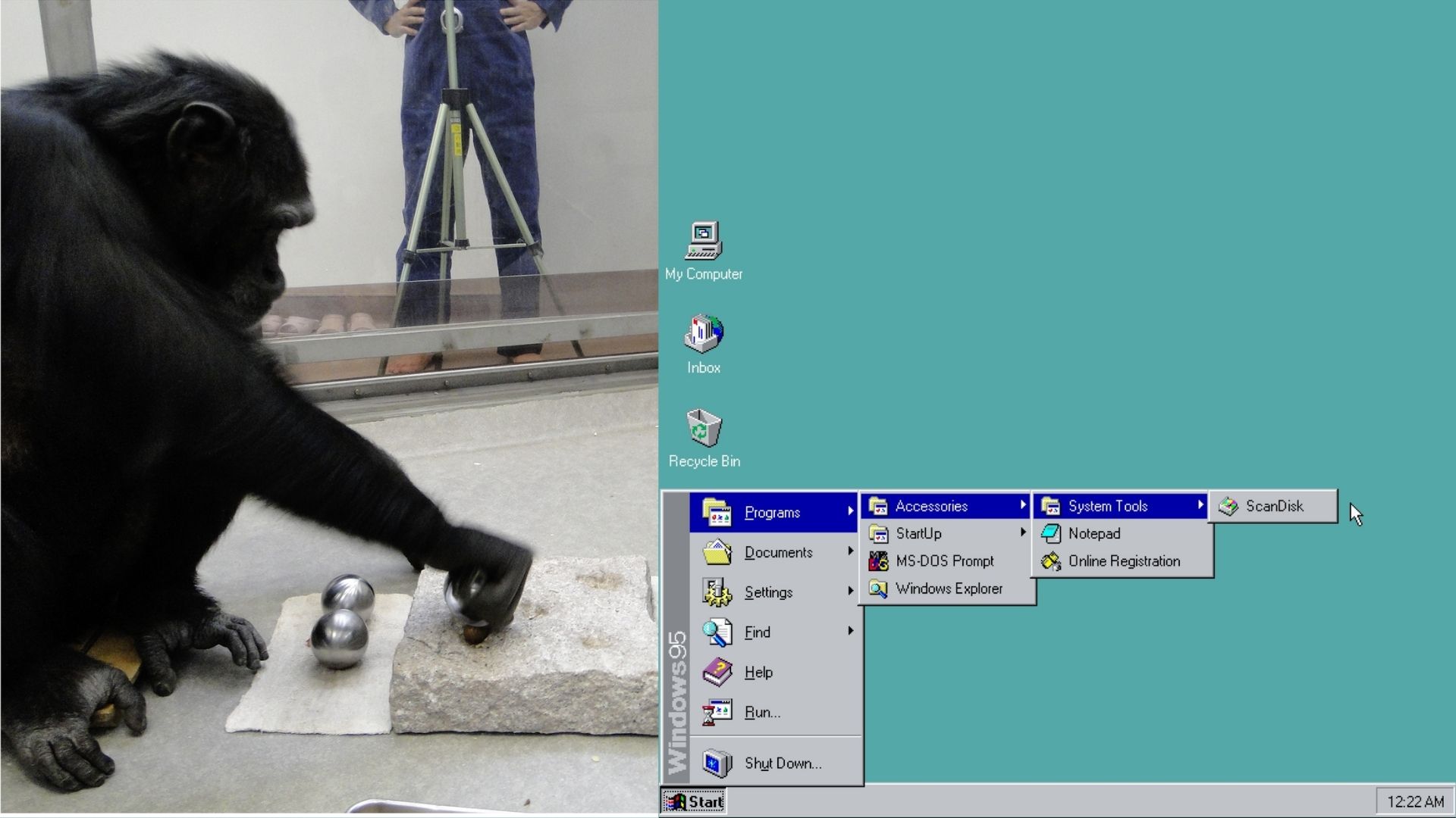
Former Microsoft exec explain how a behavioral psychologist utilized Fitts’s law to place the Windows 95 Start button in the bottom-left.
https://en.wikipedia.org/wiki/Fitts's_law
Fitts’s law (also known as Fitts’ law) is a predictive model of human movement primarily used in human–computer interaction and ergonomics. The law predicts that the time required to rapidly move to a target area is a function of the ratio between the distance to the target and the width of the target.[1] Fitts’s law is used to model the act of pointing, either by physically touching an object with a hand or finger, or virtually, by pointing to an object on a computer monitor using a pointing device.
Corners have an infinite area and are the quickest to hit.
I remember trying to explain fitts law at an old job I worked at when trying to push back against their horrible interface.
Also mouse tunnels are an embarrassment, but they made so many of them. (That’s where you mouse over something to reveal a new menu, but if you mouse out of the menus they close. If the second menu is on side and longed than the first, going from the top of the first menu to the bottom of the second will probably mouse out, and close it. Rookie mistake. Management wouldn’t listen.)
Oh God, mouse tunnels. Well, at least now I have name for that horrible flashback.
Now, Win11 (by default) puts the start menu in a variable location, so it’s both slower to interact with (more precision required) and prone to errors (misclicks).
I know from a technical standpoint, W95 was really, really shaky. But for me it was my first OS, and I think it still did a ton of stuff right.
Tada.wav
Unless you’re running multiple displays. Which I know wasn’t a thing in Win95 times, so moving to the left corner with the mouse was a guaranteed contact. I wonder if later 10/11 changed their default to the center for related reasoning, more people using centered taskbar icons in many OSes, including WIndows, and not needing help to find icons.
I wonder if later 10/11 changed their default to the center for related reasoning
As far as I can tell, the rationale for most design changes in Windows is that someone is getting paid to make design changes in Windows.
My guess is they wanted to be hip like apple’s osX’s center dock.
Yuuuup. Monkey see, monkey do
Not that it is the focus of your point, but with some specific display drivers, you could use more than one display in Win95. Technically it was possible in DOS as well with some wacky setups. It became officially supported in Win 98, I used the hell out of it back then.
I basically never click the GUI start button any more, just press the Windows/Command key and type what I need
I love that any time someone talks about how to make a UI faster or better it reverts to the keyboard. Eventually we end up back on the terminal to launch programs, including GUI ones.
Imo the ideal is a good GUI with good keyboard shortcuts. Like if you don’t remember exactly how a program is named/spelled, you’ll probably do some sort of search or autocomplete, both of which can be done in either GUI or CLI, but the GUI can show colourful icons with each match while the CLI needs to do a bunch more work to do so (and starts blurring the line between GUI and CLI if it does). Those icons make it a lot easier to find the one you’re looking for, as well as reduce ambiguity when you want to play games on a system that also manages the steam valves for the locomotive you got bored of driving.
just press the Windows/Command key and type what I need
Which on Windows 11 may or may not actually return anything remotely close to what you want.
Worked great on Windows Vista/7.
This smells apocryphal to me. Very apocryphal.
Like you don’t need a behavioral psychologist to explain why people are going to prefer putting menunthingies out of the way.
Even back before a mouse, graphical applications (like q-basic) would place their menuthingies at the top, in a header. They had already established a pattern we still largely follow today- the most general menu category goes to the right, the most specific to the left.-
File is stuff relating to the document- opening, closing, savoring; document wide settings, etc, where help is… uh… extremely specific and almost never used.
So you already have this pattern in UC design; applications are already following it because it makes sense. So now, your devs need to place another menu bar somewhere, and they place it at the bottom, so it’d out of the way of everything else, and they follow the pattern.
oh. and NeXTSTEP’s came out in '88…
I remember working with a friend and his dad to build a large shed. Because my geometry, trig, and calculus teachers were always drilling into me how eminently PRACTICAL these maths were, I thought all my training would come in handy, but every time I sat down to do a calculation, my friend and his dad would just arrange a few boards a certain way, mark one of them, and be on their way, their problem solved perfectly within their required tolerance.
Abstract thinking is often more trouble than its worth.
Aligning boards like that is kind of a form of abstract thinking. Less than using math though of course.
Agree with everything, except one thing: qbasic had a text-based user interface, and also you could use a mouse within it if you had a dos mouse driver.
The qbasic version we had was graphical in the sense of not being in dos like how nano works in the terminal today, but was not graphical in the sense of a mouse clicking things.
Granted I was like eight? So I could be miss remembering. Pretty sure the only interest I had was the gorilla game where you were chucking exploding bananas at each other.
The interface was fancier than nano’s, but still text. It didn’t draw pixels but only text characters, so it falls under text-based user interface (TUI). And also you could use a mouse to go clicking things, if you had a DOS mouse driver. The ‘pointer’, being it a TUI, was just the same character with inverted colours.
If you feel nostalgic there exists qb64. It’s almost identical to the original qbasic, with some added modern things, available for win, Mac, and Linux and compiled (transpiled) instead of interpreted, and it can run gorillas.bas!
I wouldn’t be so sure. Fitts’s law is well-known and could easily have been in the right state for this story to be true at the time. I remember learning specifically about how it applies to the corners of ths screen in a Human-Computer Interaction class once.
Fitt’s law being true or well known, and explaining why it works doesn’t mean they hired a behavioral psychologist.
This is like saying an architect hired physicist to explain why arches work; when everyone already knows that they work.
With the other UIs, like Mac’s next step and dock; they saw the same basic concept and had the ability to see real world feedback from that, no behavioral psychologist needed.
Hmm, true
oh. and NeXTSTEP’s came out in '88…
And the apple menu was already in the top left before windows 95.
I have to use Mac’s for work now and I will never understand how in 2026, they still insist on having both a dock and a system menu bar.
Like guys, it’s 2026, you can do all the OS stuff in one space, and leave the rest of the screen open for application stuff.
Have they fixed the full screen blocking important buttons already?
Or are users still using floating screens everywhere because that is the only way to use them effectively?
It’s very easy to hide it
Nope, they have not. It’s honestly a terrible OS.
I hide all that stuff and just use keyboard shortcuts. (I also use a MacBook for work like you)
The dock is basically just an application launcher/switcher and can be hidden. Personally, I much prefer the MacOS way of doing most things to either Windows or Linux. But, to each their own.
It takes up as much screen space as the Windows taskbar while doing a fraction as much.
In windows that same screen spaces acts an application launcher / switcher, but also an individual window launcher / switcher, and a clock, utility, and notification space.
Mac smears half of those into a fully separate system bar that takes up even more space.
It’s not a mac vs anyone thing, it’s not a mac way of doing things, it’s not like if they had a better dock the whole OS would have to change or fall apart, it’s simply just a badly designed dock / taskbar.
They are not objectively worse than the way Windows does it. I find it way better. The Mac way works better for me. I’ve used Windows and Linux and prefer the menu bar and dock. On Linux, I’ll use a DE that mimics the Mac way.
You may not like it. It may be inefficient for the way you work but it’s not objectively worse. There can be more than one way to do desktop interfaces. It’s OK.
I listed objective UX shortcomings with it.
I’m open to being convinced that you honestly think it’s better than the Windows one, if you can explain why.
Otherwise this sounds like reflexive defensiveness.
On Linux especially you can customize a dock to behave literally exactly the same way as Mac, so it’s honestly kind of nonsense to say that you prefer Mac’s way.
OK, that’s just ridiculous. There’s nothing objective about your criticisms unless they apply to all or even a majority of users.
The things you don’t like don’t like are not a problem and have advantages for many users. e.g. the universal menu follows Fitt’s law and works well with MacOS single document interface. The dock is an app launcher (with some other features) it can be hidden or auto hidden. It has no impact on screen real estate if you don’t let it.
There’s nothing objective about your complaints. They are personal to you. Sure, you find millions of people who agree. They don’t apply to me or millions of other MacOS users. You don’t have to like MacOS but need to a grip on the fact that your preferences are not universal. This is just silly.
Lmfao, bruh, name a way in which it’s better than the Windows dock or shut up. Jesus fucking Christ, not everything is subjective, and owning a Mac doesn’t mean you need to run out and defend every single fucking decision they’ve ever made.
When one thing does everything the other thing does, plus can do more, it might be objectively better.
Because again, you make Linux behave exactly the same as MavOS, so your claim that you think the MacOS dock is better than linuxes already shows that you’re not arguing from a logical place, just blindly defending tim apple.
You’re going crazy either way this shit, man. I never said it was better. I said I prefer it. You can’t handle that people would like something that you don’t like. Good luck with that attitude. Bye.
They corrected it in Windows 98, though, and extended the invisible, active target zone of the Start button to the outer 1-pixel boundary of the screen.
Is this actually true? I seem to remember once trying it on Windows 2000 and there it didn’t extend all the way to the edge.
Yes they had the same fuckup in the XP jellybean start button, which was later fixed.
it turned out that subject was a propulsion engineer at Boeing.
That explains it.
Oh, and unless my left hand is broken, I can use the keyboard for things in most major OSs much easier and faster than dragging the mouse alllll the way to the bottom left to hopefully find the correct part to click on.
Dave plummer is kind of a phoney
Windows peaked at 3.1
Firefox had a time where tabs had a small insensitive margin above them. (Maybe only on my DE, IDK) Made me go mad.
Although corners have infinite access, I doubt anyone is using mouse anymore to open start menu
Current fastest pipeline is Press Win button - start typing what you need
And it is convenient for eyes when menu is in the center.
Have you never worked in an office?
At least 95% of users use their cursor to open start.
The majority rarely use their keyboard for anything other than typing sentences.
I am not talking about these people. They are not bothered or affected by UX microoptinizations of having infinite speed access areas.
Judging by how my original comment is downvoted, I for sure hit something in those who are bothered and who for some unknown for me reason are still using mouse to open Start menu, so it is important for them to have it on the left.
It is literally the same as with pineapple pizza. Internet told them to hate it, so they do, lol.
As an IT professional I’ve noticed that the search bar has subsumed almost all interaction with the Start menu. Most people I work with don’t even know what it is anymore.
And that’s before the concept of typing something while Start is open to search, which is unintuitive for a lot of “monkey see/monkey do” users.
Most people I work with don’t even know what it is anymore.
At first you think its the young ones that have never used a version of Windows with the word “Start” next to, but then you run into people of any age that dont know what the start menu is and you have to start calling it the windows button. Its infuriating
I’m currently back to Win+R and either whatever I want to start or CMD, because I have to work with a bunch of Windows PCs for my job and about 30% or so will randomly decide to crash the Explorer or at least the searchbar.
On a tangent; just yesterday I had to out-bug two bugs with another two bugs, to get a notebook to almost do what I want. It’s great.
If you’re already at this point of being a computer whiz, why are you not using Windows+R and skip the middleman of the menu?